Let's Talk About Nothing: Your New Secret Weapon
Ah, empty space. That gaping, terrifying void in your retail store that whispers taunts of missed sales opportunities. Every square foot seems to scream, “You could put a display here! Or a rack! Or at least a tastefully distressed wooden crate filled with artisanal, gluten-free potpourri!” The urge to cram every last inch with merchandise is a powerful one, born from the perfectly logical (and perfectly wrong) idea that more stuff equals more sales.
But what if I told you that all that glorious, unused floor space isn't a liability? What if it's your most undervalued asset? In the chaotic world of retail, strategic emptiness—or "negative space" if you want to sound fancy at your next chamber of commerce mixer—is a powerful tool. It’s time to stop thinking of empty space as a problem to be solved and start seeing it as the secret to creating a store that customers actually want to spend time (and money) in. Let’s learn how to master the art of… well, nothing.
The Psychology of Space: Why Less Is Shockingly More
Before you start hyperventilating at the thought of voluntarily reducing your product density, let's look at the "why." Using space effectively isn't just about aesthetics; it's about manipulating customer psychology in your favor. It’s about making your products look better, your store feel calmer, and your shoppers feel smarter.
The 'Luxury' Effect and Perceived Value
Think about the last time you walked into an Apple store or a high-end designer boutique. Were the walls groaning under the weight of a thousand different products? Of course not. The products were given room to breathe, presented like museum pieces. This isn't an accident. Space signals value. A cluttered environment subconsciously tells a customer, "This is cheap, common, and you need to rummage for a deal." An open, airy layout says, "What we sell is special, curated, and worth your attention." Research shows that an overload of choices can lead to decision fatigue and anxiety. By giving your star products a literal stage, you elevate their perceived worth and make the purchasing decision feel more significant and less overwhelming.
Guiding the Customer Journey (Without Building a Maze)
Your store's layout should be an invisible guide, not an obstacle course. Clutter creates chaos, forcing customers to forge their own confusing paths. Strategic empty space, on the other hand, creates clear, intuitive walkways. It naturally directs the flow of traffic, leading shoppers past your key displays and deeper into your store. A wide, open area at the entrance—often called a "decompression zone"—allows customers a moment to transition from the hectic outside world and get their bearings. From there, well-defined aisles and strategically placed “speed bumps” (like a mannequin or a compelling product display) can gently guide their journey, ensuring they see exactly what you want them to see. You're not trapping them; you're curating their experience.
Reducing Shopper Stress and Decision Fatigue
Ever walked into a store and felt an immediate sense of anxiety? It was likely due to sensory overload. Piles of merchandise, narrow aisles, and a general lack of order create visual noise that is mentally exhausting for shoppers. A clean, organized, and spacious environment has the opposite effect. It's calming. It allows the customer to focus, browse comfortably, and enjoy the discovery process. A relaxed shopper stays longer, engages more with your products, and is far more likely to make a purchase than a stressed-out one who's just trying to escape the clutter. Don't create an experience that feels like a frantic treasure hunt; build a sanctuary they won't want to leave.
Making Space Work Smarter Than Your Busiest Employee
So, you’ve carved out some prime real estate. Now what? This isn't just about being empty for emptiness's sake. It's about making that space an active, contributing part of your sales strategy. This is where you can be truly creative and efficient.
The Welcome Mat Reimagined: Your Decompression Zone
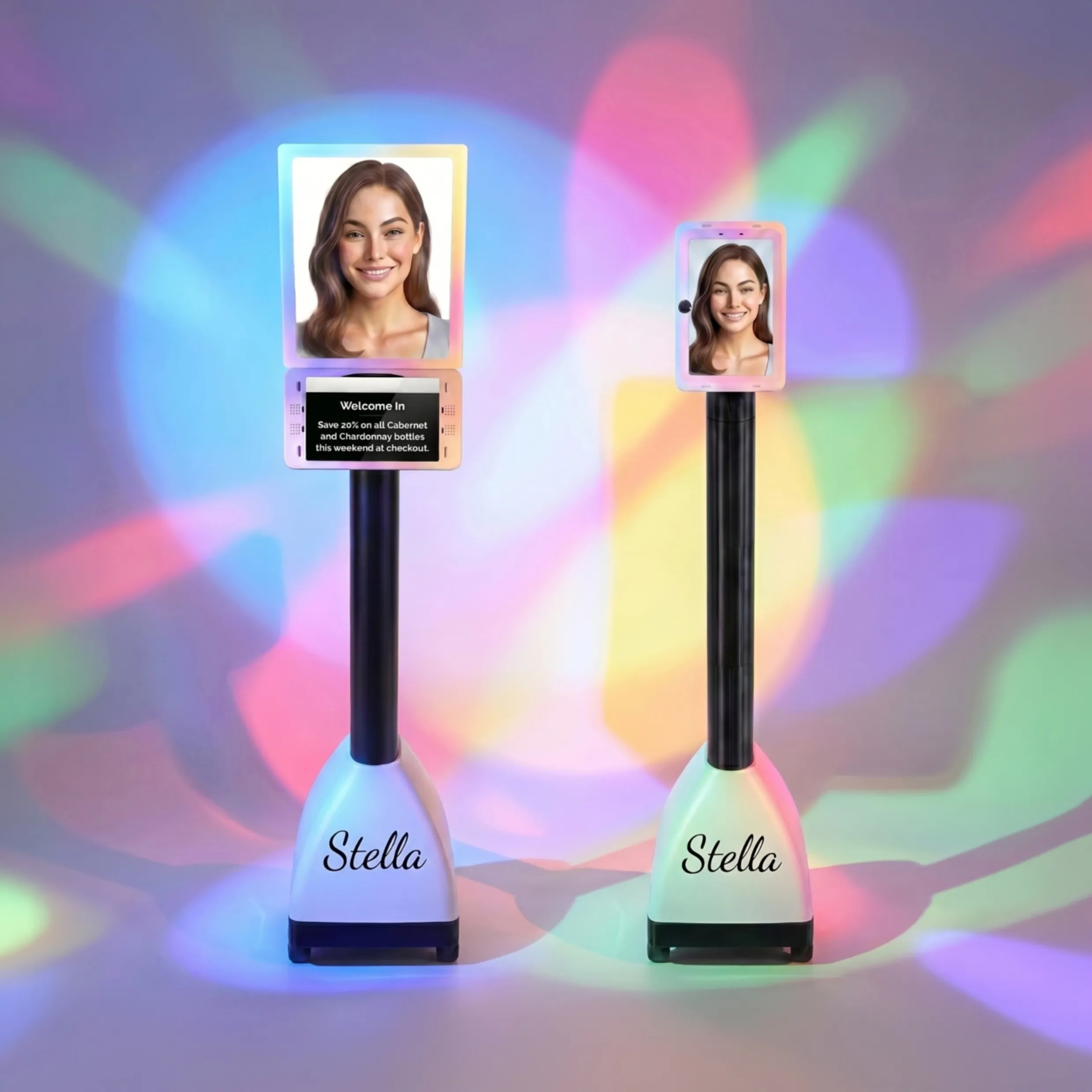
That first ten feet of your store is arguably the most important. It’s where first impressions are made and the shopping mission begins. Resist the urge to stack it high with impulse buys. Instead, keep it open and use it to set the tone. Instead of another cluttered rack, imagine this space hosting a friendly, professional greeter. A greeter who never needs a coffee break and knows every single promotion by heart. That's where an in-store assistant like Stella shines. She can greet every customer, direct them to new arrivals, and announce a flash sale—all while maintaining that clean, sophisticated entryway you've worked so hard to create. She becomes a powerful, interactive focal point without adding a single ounce of physical clutter.
Actionable Strategies for Embracing the Void
Ready to put this into practice? It might feel counterintuitive at first, but with a few key strategies, you can transform your floor plan from a cramped warehouse into a curated shopping destination.
The Art of the ‘Retail Edit’
You are a curator, not a stockroom manager. It's time to perform a "retail edit." Take a hard look at your inventory using the 80/20 rule: it's likely that 80% of your revenue comes from just 20% of your products. Are you giving that powerful 20% the spotlight they deserve? Or are they suffocated by slow-moving items that are just taking up space? Be ruthless. If a product isn't selling, doesn't fit your brand story, or just looks sad, it's time for it to go. A leaner, more focused inventory not only frees up physical space but also makes your buying decisions sharper and your brand identity clearer.
Creating 'Moments' with In-Store Experiences
Empty space is an opportunity to sell an experience, not just a product. Use that newfound room to create a "moment" that gets customers to stop, engage, and maybe even pull out their phones. Here are a few ideas:
- A comfortable seating area: A couple of nice chairs and a small table can be a haven for tired shoppers (or their bored partners). -
- An Instagrammable photo-op:
- A wall with a cool mural, a neon sign with your brand's catchphrase, or a quirky seasonal setup is basically free marketing.
- A product demo station: Create a dedicated spot where customers can see, touch, and try out a key product. This builds confidence and drives sales for higher-ticket items.
These experiential zones make your store a destination, giving people a reason to visit in person that they simply can't get online.
Using Light and Color to Define Space
You don't need walls to create distinct zones. Clever use of light and color can do the heavy lifting for you. Use spotlights to draw attention to your hero products or new arrivals, creating mini-stages throughout the store. An area rug can define a "living room" setting for home goods or a cozy reading nook in a bookstore. Painting a single wall a bold, contrasting color can create a powerful focal point that draws the eye from across the room. These techniques make your use of space feel intentional and thoughtfully designed, rather than just… empty.
A Quick Reminder About Stella
Remember, optimizing your store's layout is about making every element work for you. An AI assistant like Stella can transform your newly created welcome zone into an active engagement hub, greeting customers and driving sales from the moment they walk in—all without compromising your beautiful, open design.
Conclusion: Go Ahead, Do Nothing
Letting go of the "more is more" mentality is a bold move, but it's one that pays off. By strategically embracing empty space, you're not losing opportunities; you're gaining control over the customer experience. You're creating a more appealing, less stressful environment that elevates your products, strengthens your brand, and encourages customers to stay longer and spend more.
So, take a brave step back from your floor plan this week. Walk through your store with fresh eyes and ask yourself: what can I remove? Where can I create breathing room? How can I turn an empty corner into an engaging experience? Go on, embrace the void. It’s far more profitable (and a lot less dusty) than you think.