Is Your Store an Apple Store, or an "Everything Must Go" Liquidation Sale?
Let’s be honest. You sell sleek, futuristic technology. Your products are designed with the precision of a Swiss watch and the aesthetic of a sci-fi movie. So why does your store’s merchandising sometimes look like a chaotic tangle of charging cables that has achieved self-awareness and is plotting to take over? We’ve all seen it: shelves crammed with so many boxes they’re bowing, displays that look like they were arranged by a tornado, and enough conflicting signage to give a graphic designer a migraine.
The very products you sell scream "clean, simple, intuitive." Yet, the environment they’re sold in often screams "anxious and overwhelming." The irony is thicker than a 10-year-old user manual. The secret to breaking this cycle isn’t more shelves or bigger signs. It’s embracing a philosophy your products already live by: minimalism. It’s time to declutter the noise and let your incredible tech do the talking. (With a little help, of course.)
The Art of Saying More with Less
Minimalist merchandising isn't about having an empty store; it's about making what you do have count. It’s a strategic choice to remove distractions so customers can focus on the value, design, and function of your products. It’s the retail equivalent of a confident person who doesn't need to shout to be heard.
Curation is King (and Queen, and the Entire Royal Court)
Remember the "paradox of choice"? Present a customer with 37 different types of Bluetooth speakers, and you know what they’ll probably do? Walk away. Too many options lead to decision fatigue, not higher sales. Your job as a retailer isn't just to stock products; it's to curate them. Be the expert your customers are looking for.
- Identify Your Heroes: Apply the 80/20 rule. Which 20% of your products drive 80% of your sales? These are your heroes. Give them the spotlight they deserve. Build displays around them. Don’t bury your best-selling drone under a pile of last season’s phone cases.
- Group by Story, Not by Category: Instead of a "Headphones" wall, why not create a "Work From Home Pro" station? Feature a great webcam, a noise-canceling headset, a sleek keyboard, and an ergonomic mouse. You’re not just selling items; you’re selling a solution. This tells a story and makes upselling feel natural, not forced.
The Power of Negative Space
In the art world, negative space is the area around and between the subject(s) of an image. In retail, it’s the physical space around your products, and it's your most powerful, and cheapest, design tool. Crowding a shelf with 15 smartwatches makes them all look like cheap trinkets. Displaying just two or three on a clean, well-lit surface transforms them into premium, desirable artifacts.
Think of your store as a gallery. Each product is a piece of art. Would a museum cram priceless paintings edge-to-edge on a wall? No. They give each one room to breathe, to be appreciated. That empty space draws the eye, signals value, and makes the product feel important. It tells the customer, "Pay attention. This one matters."
A Symphony of Signage (or the Lack Thereof)
Step away from the neon-colored cardstock and the marker pens. Please. A minimalist approach to signage is about clarity and quality over quantity and chaos. A cluttered store full of competing signs—"SALE!" "20% OFF!" "NEW ARRIVAL!"—just creates visual noise that customers learn to tune out. Instead, your signage should be a quiet, helpful guide.
Opt for clean, simple typography. Use high-quality materials. Consider digital displays that can cycle through key messages without adding physical clutter. A single, elegant placard with a product name, a key feature, and a price is infinitely more effective than a dozen loud, desperate-looking signs taped to the shelf. Let your store’s atmosphere feel calm and confident, not like it’s screaming for attention at a heavy metal concert.
Let Your Tech (and Your Assistant) Do the Talking
"But wait," you say, "if I have fewer products on display and minimal signage, how will customers learn about our deals or get their questions answered?" An excellent question, and the answer is beautifully simple: you let a smarter, more elegant solution do the work. The minimalist philosophy extends beyond just your physical layout; it's about decluttering the entire customer interaction.
From Sales Pitch to Storytelling
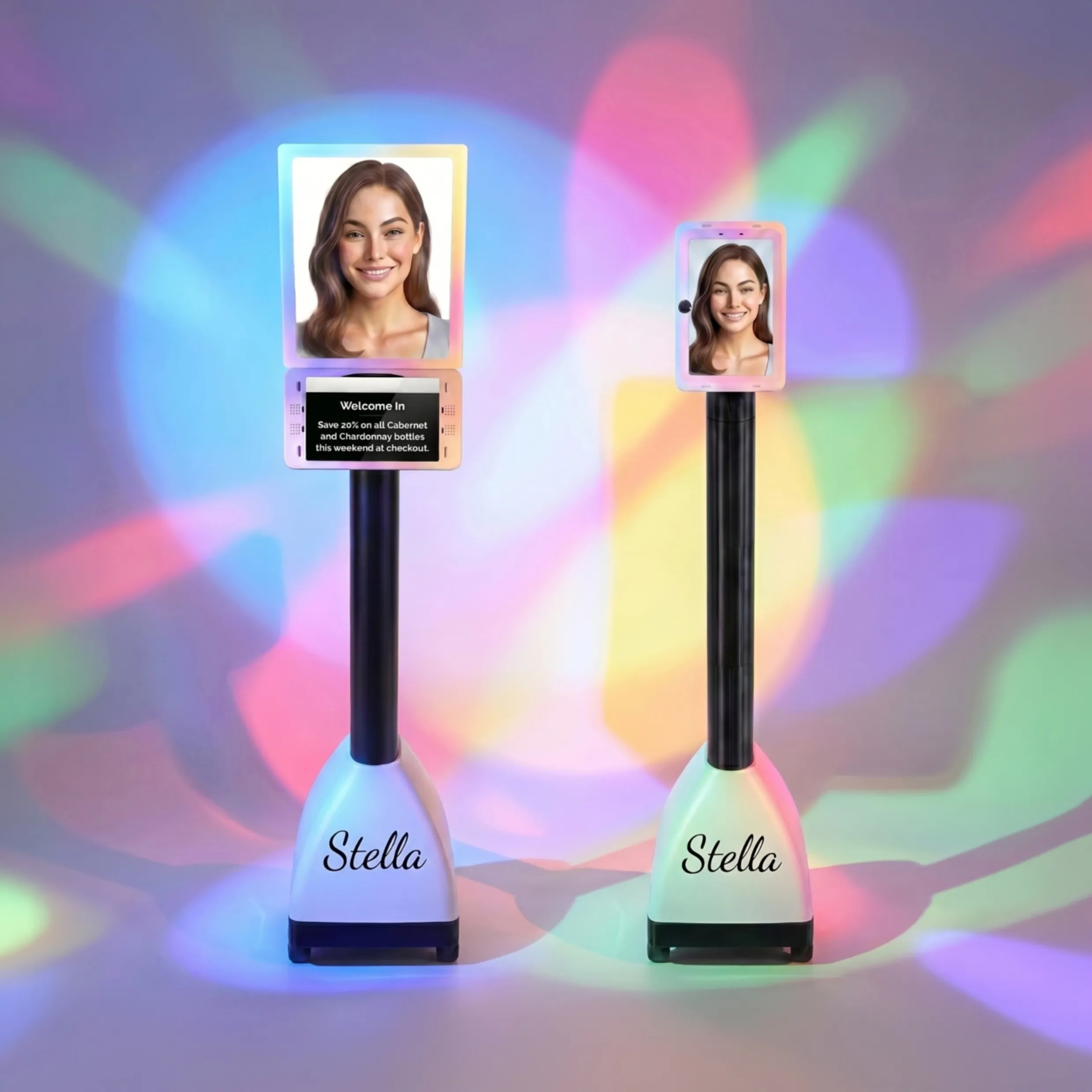
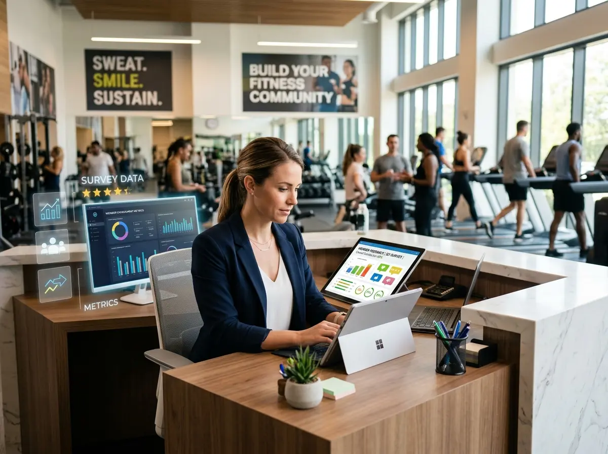
In a clean, uncluttered space, the customer's focus is squarely on the product. But that product can't always tell its full story. This is where a seamless, non-intrusive guide can make all the difference. Instead of a busy employee trying to shout over the ambient noise or a customer hunting for a tiny spec sheet, imagine a friendly, helpful presence right at the entrance. An assistant like Stella can greet every shopper, highlight the day's promotions, and answer detailed questions without adding a single piece of visual clutter to your carefully curated space. She’s the voice of your store, providing all the necessary information while your merchandising remains pristine. She ensures that "minimalist" doesn't mean "uninformative."
Practical Magic: Applying Minimalism to Your Layout
Ready to wave the magic wand of minimalism? It's less about magic and more about a few smart, strategic principles. Transforming your store's layout is one of the most impactful changes you can make, and it doesn't have to cost a fortune.
The "Decompression Zone" is Not a Myth
The first five to fifteen feet inside your door is sacred ground. It’s the "decompression zone," where shoppers transition from the outside world and adjust to your store's environment. The absolute worst thing you can do is assault them with a giant bargain bin or a towering display the second they step inside. Keep this area open, clear, and welcoming. Let them get their bearings. A simple, elegant "hero" display or a welcome mat is all you need. Give them a moment to breathe before they dive in.
Creating a Path of Least Resistance (and Most Discovery)
Great store layout is subtle psychology. Most shoppers in North America naturally turn right upon entering a store. Use this to your advantage by creating a clear, circular path that guides them through the key areas. Use your curated "hero" displays as focal points along this path to draw them deeper into the store. Your layout should feel intuitive, not like a maze. Unless you're selling escape room experiences, don't make finding the checkout counter a puzzle. The goal is a frictionless journey that encourages exploration and discovery.
Lighting: Your Most Underrated Employee
Finally, let's talk about the MVP of minimalist design: lighting. Proper lighting is the difference between a store that feels like a high-end gallery and one that feels like your uncle's basement where he "fixes" computers. In a minimalist setting, you can't hide behind clutter, so your lighting has to be perfect.
- Spotlights are your friend: Use focused track lighting to highlight your hero products. This creates contrast and drama, drawing the customer's eye exactly where you want it to go.
- Layer your lighting: Combine ambient lighting (the overall illumination) with accent lighting (spotlights) and decorative lighting to create depth and mood.
- Think temperature: Cool, bright light often feels more "techy" and modern, while warmer light can feel more inviting and comfortable. Choose a color temperature that aligns with your brand.
Good lighting makes your products look better, your store feel more premium, and your customers feel more comfortable. Don't underestimate its power.
A Quick Reminder About Stella
As you focus on creating a clean, premium in-store experience, remember that the human (or robotic) element is key. An AI retail assistant like Stella ensures that every single customer is greeted and informed, filling in the informational gaps left by minimal signage. She works 24/7 to promote your curated products and answer questions, freeing up your human staff to provide deep, personalized service where it matters most.
Conclusion: Out with the Clutter, In with the Cash
Adopting a clean, minimalist merchandising strategy isn't just about looking cool (though you absolutely will). It's a powerful business decision. It reduces shopper anxiety, highlights the value of your products, improves the customer experience, and ultimately, drives sales. It tells a story of quality, confidence, and expertise before a single word is spoken.
So take a hard, honest look at your store this week. What can you remove? What can you simplify? Start with one table or one wall. Clear it off, select one or two "hero" products, light them beautifully, and see how customers react. We’re willing to bet you’ll be pleasantly surprised. It’s time to stop shouting and start guiding. Your bottom line will thank you for it.