Confessions of a Bad Sign: Are Your In-Store Signs Scaring Customers Away?
Let’s be honest. We’ve all seen it. The handwritten sign, taped to a shelf, announcing a “SALE!” in three different colors of marker. The poster with so much text it looks like the first page of a novel, printed in a font so whimsical it’s completely illegible. These signs are the silent (and sometimes screamingly loud) ambassadors for your store. And frankly, some of them need a serious performance review.
Your signage is arguably one of the most critical, yet overlooked, aspects of your in-store marketing. It guides, informs, and persuades. A good sign can turn a browser into a buyer. A bad sign? It can cause confusion, frustration, and send a potential customer walking right out the door, straight to your competitor who understands the sacred art of typography.
But fear not. You don’t need a degree in graphic design to fix this. You just need to understand a few core principles: hierarchy, branding, and readability. Let’s save your signs (and your sales) from a life of mediocrity.
The Art of Not Shouting Everything at Once: A Guide to Visual Hierarchy
Imagine walking into a room where five people are yelling at you simultaneously. That’s what a store with poor signage hierarchy feels like. The goal is to guide the customer’s eye, not assault it. Hierarchy is about arranging elements to show their order of importance. It’s the visual equivalent of saying, “Hey, look at this first! Then this. And if you have time, here’s some fine print.”
The Three-Second Rule
You have approximately three seconds to capture a shopper's attention with a sign. That's it. Research from institutes like the Outdoor Advertising Association of America (OAAA) has shown that viewers scan, they don't read. Your sign needs a clear, three-tiered structure to be effective in that tiny window:
- The Headline: This is the star of the show. It should be the largest, boldest text and communicate the single most important piece of information. Think “50% OFF” or “New Arrivals.” It answers the customer’s first question: “What’s in it for me?”
- The Sub-Headline (or Explainer): This is the supporting actor. It provides essential context for the headline. For “50% OFF,” the sub-headline might be “All Winter Coats.” It clarifies the offer and helps the customer self-qualify.
- The Details (or Call to Action): This is the fine print. It includes things like “Ends Sunday” or “See associate for details.” This text should be the smallest, as it’s for customers who are already hooked by the first two tiers.
If your sign for a BOGO deal on socks has “Terms and conditions apply” in the same size font as “Buy One, Get One Free,” you’re doing it wrong. Let the main offer shine.
Z-Patterns and Eye Gymnastics
People in Western cultures tend to scan information in specific patterns. The most common for simple layouts is the “Z-Pattern.” The eye starts at the top-left, moves to the top-right, zips down to the bottom-left, and then across to the bottom-right. Place your most important elements—like your headline and your call to action—along this path.
For more text-heavy signs or web pages, the “F-Pattern” is common. People read the full headline, then scan down the left side, occasionally jutting out to read lines that catch their interest. What does this mean for you? Put your most compelling keywords and information on the left side of your signs to grab those scanning eyes.
Your Signs Have a Personality—Is It a Good One?
Every piece of visual material in your store contributes to your brand’s personality. Is your brand fun and modern? Sleek and luxurious? Rustic and handmade? Your signs should reflect that. Inconsistency is the enemy of a strong brand identity; it creates a subtle sense of chaos and untrustworthiness.
Brand Consistency Is Not Boring
Using the same 2-3 fonts, the same color palette, and the same logo placement across all your signage isn't boring—it's professional. It tells your customers that you are deliberate, you have a clear identity, and you care about the details. A customer who sees a cohesive visual language feels more confident in the quality of your products and your overall operation. A messy, inconsistent look can unfortunately suggest that the business itself is just as disorganized.
Let Your Digital Assistant Do the Heavy Lifting
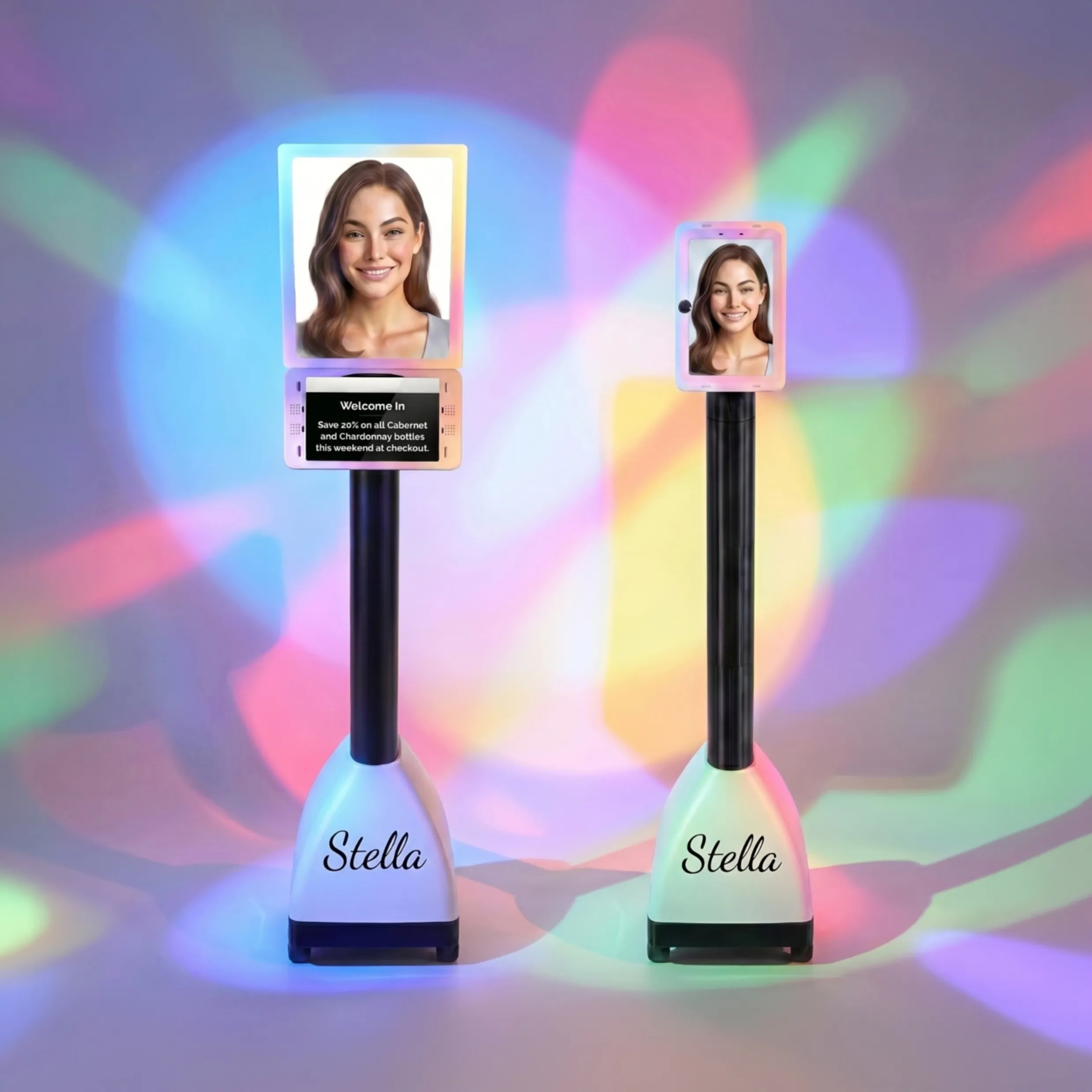
Physical signs are static. They can shout a promotion from a shelf, but they can't have a conversation. They can’t answer the inevitable follow-up questions like, “Is this included in the sale?” or “Do you have this in blue?” This is where blending your physical and digital strategies pays off. An in-store assistant like Stella can act as your "verbal signage," actively engaging customers about the very promotions your signs are highlighting. While your beautiful, uncluttered sign screams “Summer Sale,” Stella can greet a shopper and say, “Welcome! Did you know all our swimwear is part of our Summer Sale today? I can even show you where to find the cover-ups.” This allows your physical signs to remain clean and impactful, while your tireless robot assistant handles the dynamic, interactive details.
Making Sure People Can Actually, You Know, Read Your Signs
This seems like the most obvious point, but it’s where so many stores fall flat. A sign that can't be read is just expensive wallpaper. Readability is a science, combining font choice, color, size, and spacing to create something that is effortlessly consumed by the human eye.
The Great Font Debate (Please, Step Away from the Comic Sans)
Your cousin who "dabbles in design" might love expressive, curly-cue fonts, but your sales floor is not the place for them. Legibility is paramount. Here are some simple rules:
- Serif vs. Sans-Serif: Sans-serif fonts (like Helvetica, Arial, or Montserrat) are clean and modern, making them perfect for headlines and short snippets of text viewed from a distance. Serif fonts (like Times New Roman or Garamond), with the little “feet” on the letters, are often easier to read in long blocks of text, but use them sparingly in signage.
- Contrast is King: The number one rule of readability is contrast. Black text on a white background is the gold standard for a reason. Avoid low-contrast combinations like yellow on white, or red on blue. A good test? Take a black and white photo of your sign. If the text is hard to read, your contrast is too low.
- Don't Be a Font Hoarder: Stick to two, maybe three, fonts for your entire store. A common practice is one bold font for headlines and another, simpler font for body text. This creates consistency and a clean, professional look.
Size Matters (And So Does Placement)
A beautifully designed sign is useless if it’s too small to read from where your customer is standing. A general rule of thumb is the 1-inch-per-10-feet rule. For every 10 feet of viewing distance, your letters should be at least 1 inch tall. So, for a sign you want people to read from 30 feet away, your headline letters need to be at least 3 inches high.
Placement is just as crucial. Is the sign at eye-level? Is it blocked by a clothing rack or a strategically placed plant? Is it pointing to the thing it's actually describing? Walk your store from a customer's perspective. Can you easily see and understand the directional and promotional signs from the main aisles?
White Space is Not Wasted Space
There's a temptation to fill every square inch of a sign with information, logos, and starbursts. Resist this urge. White space (or negative space) is the empty area around text and images. It is not wasted space; it’s an active design element that reduces clutter, improves legibility, and helps the important elements stand out. It gives the eye a place to rest and makes the whole sign feel more elegant and less desperate. Think of it as the visual equivalent of a dramatic pause—it makes what you do say that much more impactful.
A Quick Reminder About Stella
While you’re overhauling your signage to be the pinnacle of visual communication, remember that some jobs are still best handled with a personal touch. Stella, your in-store robot assistant, is the perfect complement to great signage, engaging customers verbally, answering their questions in real-time, and ensuring your beautifully designed promotions get the attention they deserve.
Conclusion: Your Action Plan for Signage Salvation
Great signage isn’t about being a world-class designer. It’s about clarity, consistency, and a little bit of empathy for your customer. It’s about making their shopping journey easier and more enjoyable. Your signs are working for you 24/7, so make sure they’re putting in a good effort.
Here’s your homework:
- Take a Walk: Go into your store tomorrow with fresh eyes. Pretend you’re a first-time customer. Are the signs confusing? Are they consistent? Can you read them from a reasonable distance?
- Perform a Sign Audit: Get rid of the cluttered, handwritten, and off-brand signs. Identify the top 3-5 key messages you need to communicate (e.g., promotions, new products, store sections) and focus on making those signs perfect.
- Embrace the System: Create a simple template for your signs using a consistent hierarchy, brand palette, and set of fonts. It will make creating new signs faster and ensure your store always looks polished and professional.
Your signs are a direct reflection of your business. By focusing on a clear hierarchy, strong branding, and simple readability, you can transform them from a liability into one of your most effective sales tools.