Welcome to the Wild World of Web Accessibility
Let's start with a quick scenario: You've spent months building a beautiful retail website. The colors are on-brand, the product photos are stunning, and checkout is (mostly) seamless. You're feeling great. Then someone points out that your site is completely inaccessible to a significant portion of the population — and that you might be legally liable for it. Not so great anymore, right?
ADA compliance for retail websites isn't exactly the most thrilling topic on your to-do list. But here's the thing — it matters enormously, both ethically and legally. Over 26% of U.S. adults live with some form of disability, according to the CDC. That's roughly 61 million potential customers who may be struggling to navigate your site right now. And if that doesn't move you, consider that ADA-related website lawsuits have surged dramatically in recent years, with thousands of cases filed annually against businesses of all sizes.
The good news? Becoming more accessible isn't as complicated as it sounds. This guide will walk you through what ADA compliance actually means for your retail website, how to audit where you stand, and what practical steps you can take to make your digital storefront welcoming to everyone — not just the people who happen to have perfect vision and nimble fingers.
Understanding ADA Compliance for Retail Websites
What the ADA Actually Says About Websites
The Americans with Disabilities Act was signed into law in 1990 — well before most people knew what a website was. So you'd be forgiven for assuming it doesn't apply to your online store. Unfortunately, courts and the Department of Justice have increasingly interpreted the ADA to cover websites as "places of public accommodation," particularly when they're connected to a physical retail location.
The current gold standard for web accessibility is the Web Content Accessibility Guidelines (WCAG), developed by the World Wide Web Consortium. Most legal guidance and court decisions reference WCAG 2.1 at Level AA as the benchmark retailers should aim for. These guidelines are organized around four core principles: your website must be Perceivable, Operable, Understandable, and Robust — sometimes called the POUR principles.
In plain English, this means users should be able to perceive your content (even without sight or hearing), operate your site (even without a mouse), understand your navigation (even with cognitive differences), and access your content using assistive technologies like screen readers. Simple in concept, occasionally challenging in execution.
Who Is Actually at Risk?
You might be thinking, "I run a small boutique — surely the ADA police aren't coming for me." And while it's true that larger retailers have been hit with the most high-profile lawsuits (Domino's, Nike, and Winn-Dixie have all faced notable cases), small and mid-sized retailers are increasingly targeted as well. Plaintiff law firms have become remarkably efficient at identifying non-compliant sites at scale.
The reality is that any retail business with a public-facing website is potentially exposed. Businesses that have a physical location and a website face particularly clear legal exposure, since courts have consistently ruled that the website is an extension of the physical place of business. If you sell products or services online — even as a secondary channel — you're on the radar.
The Most Common Accessibility Failures (And How to Fix Them)
Images Without Alt Text
This is the low-hanging fruit of accessibility failures — and also one of the most common. Alt text (alternative text) is a brief description attached to an image that screen readers can read aloud to visually impaired users. If your product photos, banners, and promotional graphics have no alt text, a screen reader user essentially encounters a wall of silence where your beautiful merchandise should be.
The fix is straightforward: go through your website and add descriptive, meaningful alt text to every image. For product photos, this means describing the item accurately — not just typing "image" or leaving the field blank. Most website platforms (Shopify, WooCommerce, Squarespace, Wix) have a built-in alt text field for every image. Use it. Your future customers — and your legal team — will thank you.
Poor Color Contrast and Visual Design
That light gray text on a white background might look sleek and modern. It is also, unfortunately, nearly impossible to read for people with low vision or color blindness. WCAG 2.1 AA requires a contrast ratio of at least 4.5:1 for normal text and 3:1 for large text. You can check your current contrast ratios using free tools like WebAIM's Contrast Checker or the browser extension Colour Contrast Analyser.
Beyond contrast, watch out for relying on color alone to convey information. If your "Add to Cart" button turns red when an item is out of stock, that's not accessible for colorblind users. Add a text label too. Accessibility-friendly design is often just good design with a little extra intention baked in.
Keyboard Navigation and Form Accessibility
Many users with motor disabilities navigate websites entirely using a keyboard rather than a mouse. This means your entire site — every menu, button, product page, and checkout form — needs to be fully operable via keyboard alone. Tab through your own website right now and see what happens. If you get stuck, your users do too.
Forms deserve special attention. Every form field should have a visible, associated label (not just placeholder text that disappears when someone clicks in). Error messages should be descriptive and clearly linked to the relevant field. And your checkout process — arguably the most important part of your retail site — should be fully accessible or you're literally turning away customers at the digital cash register.
A Little Help Goes a Long Way
How Technology Can Support Your Accessibility Efforts
While no single tool can make your website fully ADA compliant on its own (yes, even those AI-powered overlay widgets have serious limitations and have been challenged legally), the right technology can absolutely support your broader accessibility strategy. Automated audit tools like Google Lighthouse, WAVE, or Deque's axe can scan your site and flag common issues, giving you a prioritized list of what to fix. Running these audits regularly — especially after site updates — keeps accessibility from falling through the cracks.
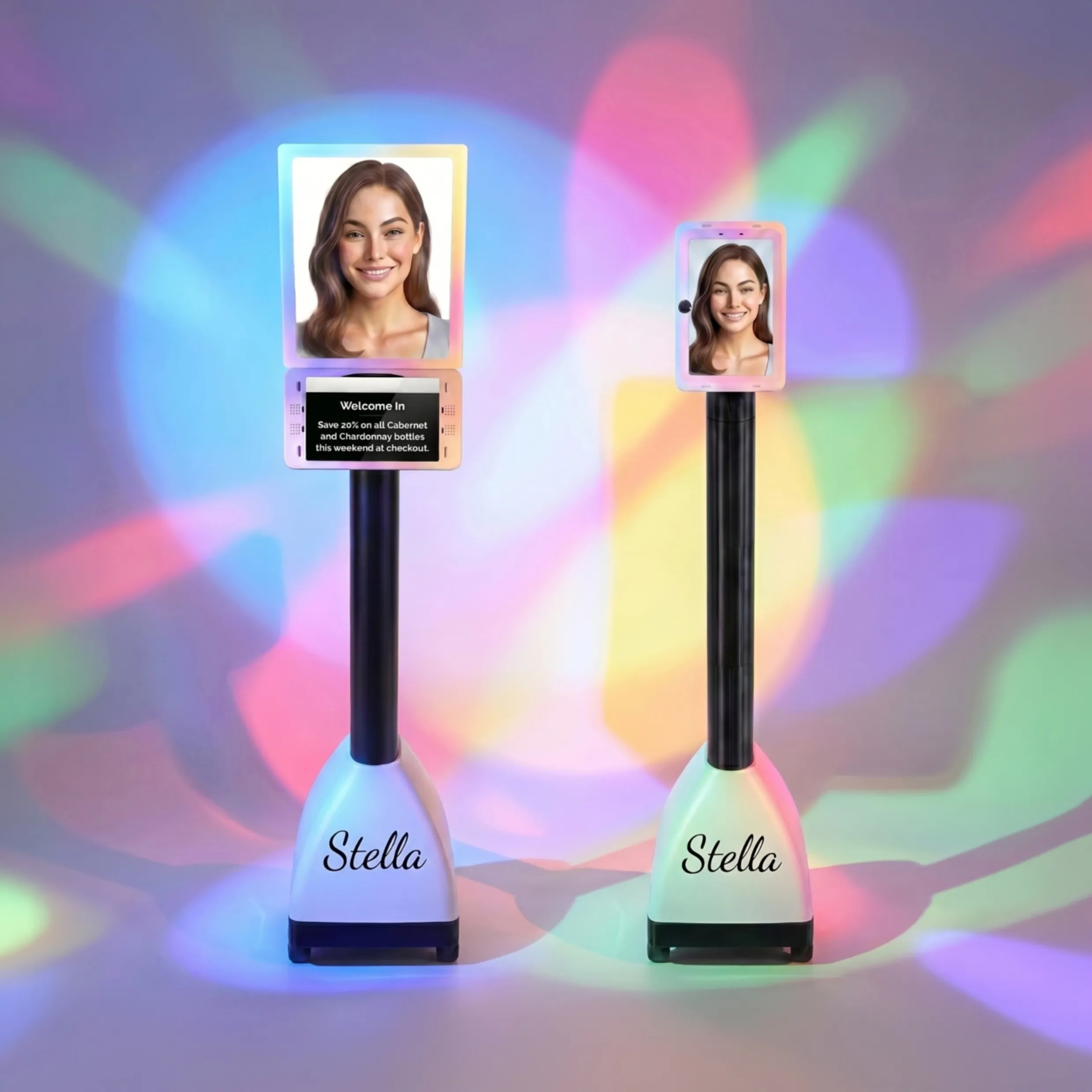
And speaking of technology that works for everyone: Stella, the AI robot employee and phone receptionist, is a great example of how accessible customer engagement can extend beyond your website. For retail stores with a physical location, Stella stands inside the store and naturally converses with customers — including those who may find digital interfaces challenging. Her phone answering capability means that customers who prefer to call rather than navigate a website (a common preference among older adults and people with certain disabilities) always reach a knowledgeable, friendly voice available 24/7. Accessibility isn't just a website issue — it's about making your entire business welcoming across every touchpoint.
Taking Action: Your ADA Compliance Roadmap
Conducting a Website Accessibility Audit
Before you can fix anything, you need to know what's broken. Start with a combination of automated and manual testing. Run your site through a free tool like WAVE (wave.webaim.org) or Google Lighthouse (built into Chrome DevTools). These tools will surface the most obvious violations quickly. Then do a manual review — navigate your site using only a keyboard, zoom in to 200%, and if possible, run a screen reader like NVDA (free on Windows) or VoiceOver (built into Mac and iOS) to experience your site as a visually impaired user would.
Document everything you find, prioritize by severity and frequency, and create a realistic remediation plan. You don't have to fix everything overnight, but having a documented plan and showing good-faith effort matters significantly if you ever face a complaint.
Writing an Accessibility Statement
Once you've started making improvements, publish an Accessibility Statement on your website. This is a dedicated page that outlines your commitment to accessibility, identifies any known limitations, and — critically — provides a way for users to report issues or request assistance. Something like: "If you experience difficulty accessing any part of our website, please contact us at [email/phone] and we'll be happy to assist."
An accessibility statement won't make you immune to lawsuits, but it demonstrates good faith and gives users a constructive path forward rather than a frustrating dead end. It also signals to your community that you actually care about serving everyone — which, frankly, is good for business.
Making Accessibility an Ongoing Practice
Here's the part most guides conveniently skip: ADA compliance isn't a one-time project. Every time you redesign a page, add new products, run a promotional campaign with new graphics, or update your checkout flow, accessibility needs to be part of the conversation. Build it into your content workflow by adding accessibility checks to your publishing checklist, training your team on alt text and form labels, and scheduling quarterly audits to catch anything that slips through.
Consider designating someone on your team as your accessibility point person — even if it's just "whoever updates the website." Having clear ownership means it doesn't become everyone's responsibility and therefore no one's responsibility. And if your budget allows, periodic reviews by a professional accessibility consultant or user testing with people who have disabilities will catch issues that automated tools simply cannot.
A Quick Reminder About Stella
Stella is an AI robot employee and phone receptionist built for businesses of all kinds — from retail stores and salons to medical offices and service providers. She greets customers in person at her in-store kiosk, answers phone calls 24/7, promotes your current deals, and handles questions so your staff can focus on what they do best. At just $99/month with no upfront hardware costs, she's an approachable way to add a reliable, professional presence to your business — on the floor and on the phone.
Your Next Steps: Making Accessibility a Priority
Let's be real — nobody gets into retail because they love reading legal guidelines about web accessibility. But the stakes are real, the tools are available, and the payoff goes well beyond avoiding lawsuits. An accessible website is a better website. It loads faster, it ranks better in search engines, it converts more customers, and it communicates something important about your brand: that you welcome everybody.
Here's your actionable summary to get started:
- Run a free audit today. Visit wave.webaim.org and scan your homepage. You'll have a list of issues within minutes.
- Fix the quick wins first. Add alt text to images, improve color contrast, and label your form fields. These are high-impact, low-effort changes.
- Tab through your entire site. If you get stuck anywhere using only a keyboard, your users do too. Fix it.
- Publish an Accessibility Statement. Show your customers and any potential plaintiffs that you take this seriously.
- Make it a habit. Add accessibility checks to your content workflow and schedule quarterly audits.
Accessibility isn't a burden — it's an opportunity to reach more customers, build a stronger brand, and do right by the people who want to shop with you. And in a competitive retail landscape, that's not something to overlook. Now go check your alt text.