Your Contact Form Is Losing You Money (Let's Fix That)
Here's a fun game: go to your own website right now and try to fill out your contact form. Really do it. Time how long it takes, notice how many fields you're forced to complete, and ask yourself honestly — if you were a potential customer, would you finish it? If your answer involves the phrase "well, it's not that bad," congratulations, it's probably bad.
For service-based businesses, the contact form is often the single most important conversion point on your entire website. It's the bridge between "just browsing" and "take my money." And yet, most business owners spend hours agonizing over their logo colors and approximately eleven minutes thinking about their contact form. The result? A leaky funnel that quietly bleeds out leads while you wonder why your marketing isn't working.
The good news is that a high-converting contact form isn't rocket science. It's a combination of smart design, strategic questions, and a frictionless experience that makes potential clients feel like reaching out is the easiest decision they've ever made. Let's break it down.
The Anatomy of a Contact Form That Actually Works
Before you can fix your form, you need to understand what separates a form that converts from one that makes visitors close the tab. Spoiler: it usually comes down to three things — length, relevance, and trust.
Keep It Short (But Not Too Short)
Every field you add to a contact form is a tiny hurdle your potential client has to jump. Research from HubSpot found that reducing form fields from four to three can increase conversions by as much as 50%. That's not a typo. Fewer fields, more leads.
For most service-based businesses, the sweet spot is three to five fields. You need a name, an email or phone number, and one or two fields that give you enough context to follow up meaningfully. That's it. You don't need their budget range, their grandmother's maiden name, or a detailed project description before you've even had a conversation. Save the deep-dive questions for your intake process.
That said, "too short" is also a real thing. A form that only asks for a name and email might generate more submissions, but it'll generate more tire-kickers too. One well-placed qualifying question — like "What service are you interested in?" — helps you prioritize follow-ups and arrive at the first conversation prepared.
Ask the Right Questions in the Right Order
Form field order matters more than most people realize. Lead with the easy stuff — name, email, phone. These are low-friction because people fill them out on autopilot. Once someone has started a form, psychological momentum kicks in and they're more likely to complete it. Conversion experts sometimes call this the "foot-in-the-door" principle, and your contact form is a great place to put it to work.
Place your open-ended or more personal questions toward the end. By the time someone reaches "Tell us a little about what you're looking for," they've already committed to the interaction. You'll get better, more thoughtful responses, and fewer abandonments.
Build Trust at the Point of Submission
People are increasingly cautious about sharing their contact information, and rightfully so. A few simple trust signals near your form can meaningfully improve conversions. Consider adding a brief note about how quickly you respond, a short testimonial from a happy client, or even just a friendly line like "No spam, ever. We'll reply within one business day."
If you have any relevant credentials, certifications, or recognizable client logos, this is a great place to show them. Trust doesn't happen by accident — you have to build it deliberately, even in small moments like a contact form submission.
Tools and Technology That Streamline Your Intake Process
Even the best contact form in the world is only as good as what happens after someone hits submit. This is where a lot of service businesses fumble — the form converts, but the follow-up is slow, inconsistent, or nonexistent. That's where smart tools make a real difference.
Automate Your Follow-Up Without Losing the Human Touch
The moment someone submits your contact form, the clock starts ticking. Studies consistently show that responding to a lead within five minutes makes you up to 100 times more likely to connect with them compared to responding an hour later. Yes, 100 times. And yet most small service businesses respond in hours — or days.
Setting up an automated confirmation email is the bare minimum. It reassures the prospect that their message landed, sets expectations for response time, and keeps your business top of mind while you're busy actually doing the work. Tools like email automation platforms or your CRM can handle this easily. The key is making it sound human. "Thanks for your inquiry, reference number 48291" is not human. "Hey Sarah, thanks for reaching out — we'll be back to you by end of day tomorrow!" is human.
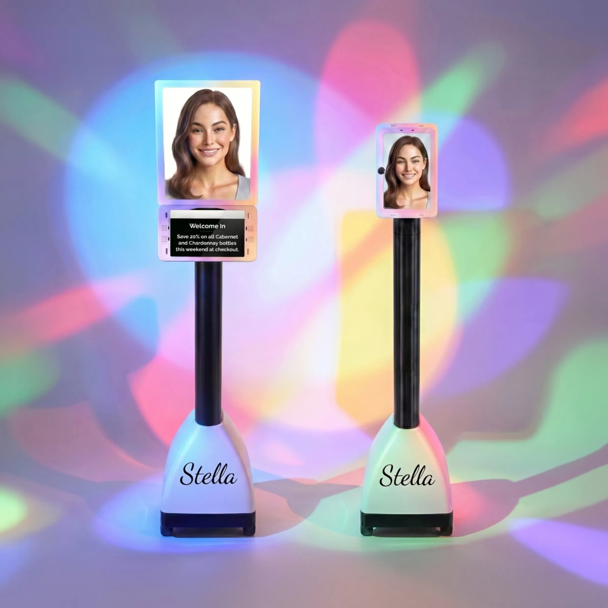
How Stella Fits Into Your Lead Intake Strategy
Here's something worth thinking about: what happens to potential clients who don't fill out your contact form? What about the ones who would rather call, or who submit the form after hours and then call the next morning before you've had your coffee? Those leads need somewhere to go too.
Stella, the AI robot employee and phone receptionist, handles exactly this kind of gap. For service businesses with a physical location, she stands inside your space and proactively engages walk-ins, answering questions about your services and even collecting client information right at the kiosk. For phone calls — which, let's be honest, still happen constantly in service industries — she answers 24/7 with full knowledge of your business, collects intake information through natural conversation, and feeds it directly into her built-in CRM. That CRM includes custom fields, contact tags, notes, and AI-generated client profiles, so when you or your team follows up, you're already walking in informed. No more sticky notes. No more "wait, which Sarah was this?"
Optimizing for Conversions: The Details That Move the Needle
Once your form has solid structure and your follow-up process is buttoned up, the next level is optimization — the small tweaks that, collectively, can make a significant difference in how many visitors actually convert.
Your Call-to-Action Copy Is Probably Boring
Look at your submit button. Does it say "Submit"? Does it say "Send"? These words are fine in the same way that a beige wall is fine — technically functional, entirely forgettable. Your call-to-action button is the last thing someone reads before they commit, and it's worth treating it with a little more respect.
Try something specific to the value the prospect is about to receive. "Get My Free Consultation," "Book My Appointment," or "Let's Talk" all perform meaningfully better than "Submit" in A/B tests. It's a one-word-to-five-word change that reframes the action from "I'm giving you my information" to "I'm about to get something valuable." That mental shift matters.
Mobile Optimization Is Non-Negotiable
More than half of all web traffic now comes from mobile devices, and a form that looks clean on a desktop can be an absolute nightmare on a phone. Tiny tap targets, fields that don't auto-fill, and layouts that require horizontal scrolling are all silent conversion killers. Test your form on your actual phone — not just in a browser preview — and fix anything that makes you sigh.
Practical mobile form tips include using large tap targets for fields and buttons, enabling autofill for standard fields like name and email, minimizing the number of fields (even more critical on mobile), and using dropdown selectors or radio buttons instead of open text wherever possible. Small friction, big impact.
A/B Test Your Way to Better Results
You don't have to guess what works — you can test it. A/B testing your contact form doesn't require a data science degree. Most form tools and website platforms let you create two versions of a page and split traffic between them. Test one variable at a time: your headline, your button copy, the number of fields, or the placement of trust signals. Give each test enough time to reach statistical significance (usually a few hundred visits at minimum), then keep what wins and move on to the next test.
The businesses that consistently out-convert their competitors aren't smarter — they're just more willing to iterate. Treat your contact form like a living document, not a "set it and forget it" feature.
Quick Reminder About Stella
Stella is an AI robot employee and phone receptionist built for businesses of all sizes — from solo service providers to multi-location operations. She greets customers in person at your physical location, answers phone calls around the clock, promotes your services, handles intake, and keeps your CRM organized, all for just $99 a month with no upfront hardware costs. Think of her as the team member who never calls in sick and always knows what's on special.
Your Next Steps Toward a Contact Form That Works
Fixing your contact form is one of the highest-ROI improvements you can make to your service business website, and most of it costs nothing but time and attention. Here's where to start:
- Audit your current form. Fill it out yourself. Time it. Count the fields. Be honest about the experience.
- Cut it down. Remove any field that isn't truly necessary to initiate a conversation. You can always ask more questions later.
- Rewrite your CTA button. Make it specific, benefit-oriented, and action-driven.
- Add at least one trust signal near the form — a response time promise, a short testimonial, or a relevant credential.
- Set up an automated confirmation email that sounds like a human being wrote it.
- Test your form on mobile and fix any friction points you find.
- Start A/B testing. Pick one variable, test it, and build a habit of iteration.
Your contact form isn't just a formality — it's a salesperson that works around the clock, never asks for a commission, and either earns your business's trust or quietly loses it every single day. Give it the attention it deserves, and it'll return the favor.