Your Contact Form Is Losing You Money (But It Doesn't Have To)
Let's be honest: most contact forms are the digital equivalent of a suggestion box that nobody ever checks. You slap a few fields on a page — Name, Email, Message — hit publish, and call it a day. Then you wonder why inquiries trickle in like a leaky faucet instead of flowing like a fire hose.
For service-based business owners, the contact form isn't just a courtesy feature. It's often the first real interaction a potential client has with your business, and it sets the tone for everything that follows. A clunky, confusing, or uninspiring form doesn't just lose conversions — it actively tells visitors that working with you might be equally clunky, confusing, and uninspiring.
The good news? A few smart, intentional changes can transform your contact form from a digital dust collector into a genuine lead-generation machine. Here's how to do it right.
The Anatomy of a Contact Form That Actually Converts
Before you redesign anything, it helps to understand what separates a form that converts from one that doesn't. Spoiler alert: it's rarely about design. It's almost always about clarity, friction, and trust.
Ask Only What You Actually Need
There's a temptation — especially among detail-oriented business owners — to use the contact form as an intake questionnaire, a personality assessment, and a background check all rolled into one. Resist it. Research consistently shows that reducing form fields from four to three can increase conversions by as much as 50%. Every field you add is a small ask of the visitor's time and attention, and those asks add up fast.
For most service-based businesses, you genuinely only need a name, a contact method (phone or email), and a brief description of what they need. If your service requires more detail before you can even respond meaningfully — say, you're a contractor or a custom event planner — you can ask one or two qualifying questions, but keep them purposeful. "How did you hear about us?" is curiosity. "Please describe your project in detail" is homework. Know the difference.
Write Copy That Feels Human
Your form fields don't have to read like a tax document. Instead of "Full Name," try "Your Name." Instead of "Message," try "Tell us what you're looking for" or "What can we help you with?" These tiny language tweaks make your form feel like the beginning of a conversation rather than the beginning of a transaction — and that matters enormously in service industries where trust is the product.
Your submit button deserves special attention. "Submit" is possibly the least inspiring word in the English language. Replace it with something specific and action-oriented: "Get My Free Quote," "Book a Consultation," or "Let's Talk." The button copy should reflect the value the visitor is about to receive, not just the mechanical act of clicking.
Make Your Form Impossible to Miss — and Easy to Find
You'd be surprised how many business owners bury their contact form on a page three clicks deep, accessible only through a navigation item labeled "Contact" in a font size typically reserved for footnotes. If you want conversions, your form needs to be prominent. Consider embedding a short version directly on your homepage, adding a persistent call-to-action button in your navigation bar, or including a form on every service page so visitors can convert at the moment of peak interest rather than hunting for a contact page later.
What Happens After the Form — And Why It Kills More Deals Than the Form Itself
Here's the part that most guides conveniently skip: converting a form submission into an actual paying client requires a fast, professional follow-up. According to a widely cited study from Harvard Business Review, businesses that respond to leads within an hour are seven times more likely to qualify that lead than those who respond even an hour later. Seven times. And most small service businesses are responding in hours — or days.
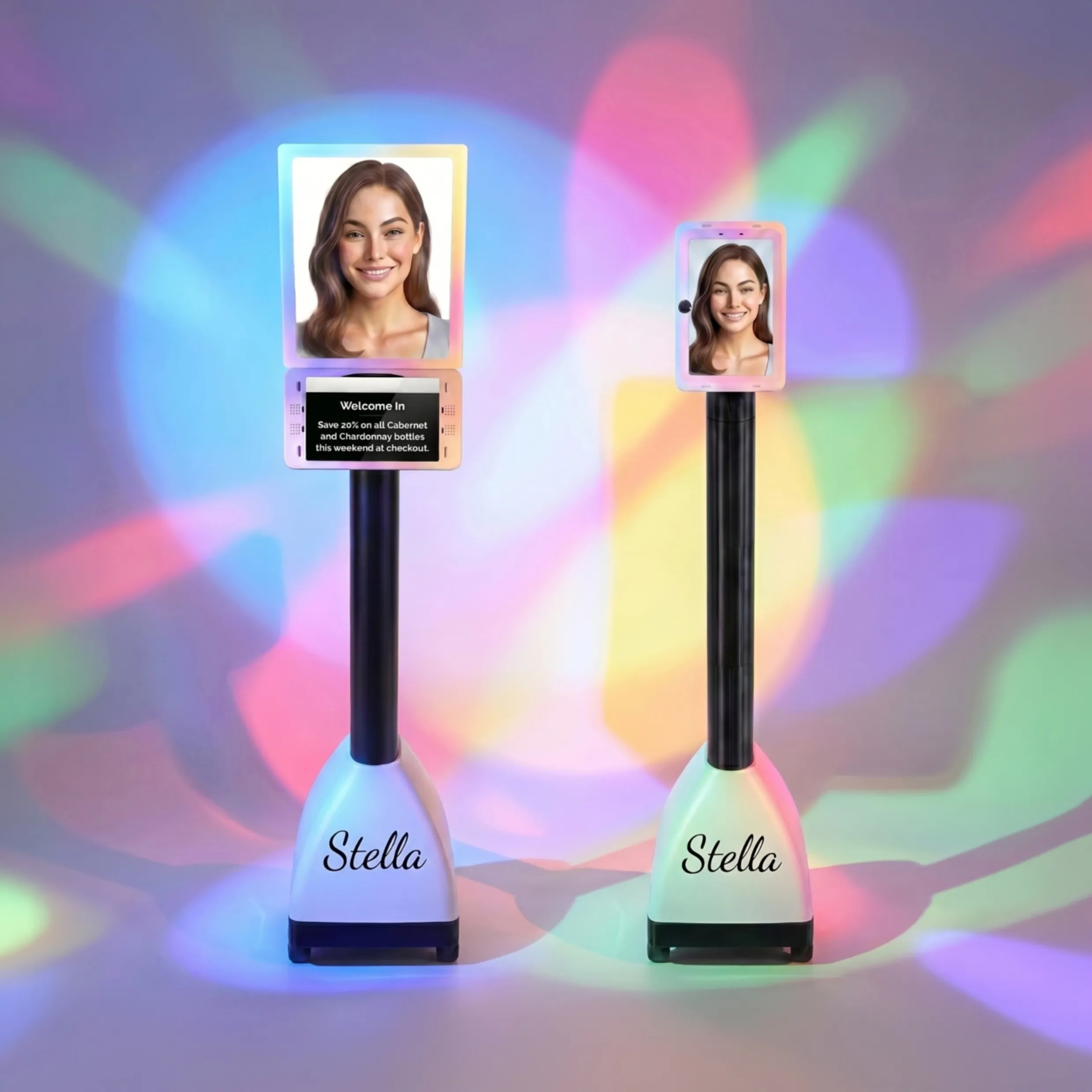
How Stella Can Help Close the Gap
This is exactly where Stella earns her keep. While your contact form is handling web inquiries, Stella is handling the other half of your inbound leads: phone calls. She answers every call, 24/7, with the same knowledge and professionalism as your best human staff member — without the sick days, the attitude, or the sudden two-week notice. For service businesses that rely on phone inquiries as much as web forms, this matters enormously.
Stella also comes with built-in intake forms and a CRM that work across phone calls, web interactions, and — if you have a physical location — her in-store kiosk. When a customer calls to inquire about a service, Stella can walk them through a conversational intake, collect their information, and add them directly to your CRM with AI-generated notes and profile summaries. No manual data entry. No missed details. No leads falling through the cracks because someone forgot to write something down.
Optimization Strategies That Move the Needle
Once your form is live and your follow-up process is solid, it's time to think about continuous improvement. A contact form is never truly "done" — it's a living asset that should be tested, refined, and improved over time.
Add Social Proof Near Your Form
Visitors who land on your contact page are interested but not yet committed. They're in the mental space of "Should I bother?" A well-placed testimonial, a star rating, or a simple stat like "Trusted by over 500 homeowners in the greater Atlanta area" can provide the final nudge they need. Social proof near a conversion point — not just on a dedicated testimonials page — has been shown to increase form completions significantly. Think of it as a warm handshake right before someone signs on the dotted line.
Use Conditional Logic to Personalize the Experience
If your business offers multiple distinct services, a one-size-fits-all form is a missed opportunity. Conditional logic — available in most modern form builders — allows you to show different follow-up fields based on what a visitor selects. A law firm might show different questions to someone inquiring about estate planning versus a personal injury case. A salon might ask different things of a new client booking a haircut versus someone inquiring about bridal packages. This makes the form feel tailored and relevant, which builds confidence and increases the likelihood of completion.
A/B Test Your Way to Better Results
You don't have to guess what works. Most form tools and landing page platforms offer A/B testing, which lets you run two versions of your form simultaneously and see which one converts better. Test one variable at a time — the headline above your form, the button copy, the number of fields, or even the form's position on the page. Over a few weeks, the data will tell you exactly what your specific audience responds to. This isn't a tactic reserved for big companies with marketing departments. It's something any business owner can implement with minimal technical knowledge and zero extra budget.
Quick Reminder About Stella
Stella is an AI robot employee and phone receptionist designed for businesses of all sizes — from solo service providers to multi-location operations. She greets customers in person at her kiosk, answers phone calls around the clock, manages intake and CRM data automatically, and promotes your services with the enthusiasm of a very well-trained (and tireless) team member. All of this starts at just $99/month with no upfront hardware costs.
Your Next Steps Toward a Form That Works as Hard as You Do
If you've made it this far, you're already ahead of most of your competitors — because most business owners set up a contact form once and never think about it again. The businesses that win are the ones that treat every touchpoint, including that humble little form, as an opportunity to make a great impression.
Here's a practical action plan to get started:
- Audit your current form. Count your fields. Read your copy out loud. Try submitting it on a mobile device. If anything feels clunky, fix it this week.
- Rewrite your submit button. Make it specific to the value the visitor receives. Do this today — it takes five minutes and often produces immediate results.
- Shore up your follow-up process. Whether that's setting up an automated confirmation email, committing to a response-time standard, or exploring tools like Stella to handle phone inquiries in real time, make sure no lead goes cold because of slow response.
- Add social proof near the form. Pull your best testimonial and put it somewhere visible on the contact page by end of week.
- Set a reminder to review form performance monthly. Look at completion rates, drop-off points, and conversion quality. Adjust accordingly.
A contact form that converts isn't magic. It's the result of clear thinking, deliberate copy, and a genuine respect for the visitor's time and intelligence. Make yours worthy of the clients you actually want — and then make sure you're ready to respond when they reach out.